Friday, 30 October 2009

Project two - spaces... Titus Groan (plus some work from technical class - graphics tablets)


Dear Mr Blog.

Yes indeed, its time to pick up the pencil once again. Well, in this occassion, im hoping it will be the graphics tablet. A noOb to such technology, one does feel somewhat behind. I will pick it up quickly though, I can assure you of that...

We have been given different folders with different stories unknown to us before opening...
What did I get I hear you ask!? - Titus Groan.

Now, to me, this was a win/loose situation. After hearing about some fellow classmates geting such tales as "the wizard of Oz", something most people visually know rather well, coming across a story id never heard of before sank my stomach into a dirty dark pitt. Then when trying to pick up the peices, I realised... this isnt a bad thing at all! I can really play around with the visualisations from my own imagination, there is no given limits, no artistic blocks in my head holding me back.

The story of "Titus Groan" is based on the settings of a huge elegant castle, overlooking a land with its wealthy stature and presence. The rich owners of this castle, the Groan family, are rather self obsorbed and lack gratitude for their status. Outside of their wealthly haven is a much lower standard of life, the ground from which live the Peasants! Within the story there are confrontations between characters that result in attempts to storm into the Castle, or entry to the Castle being few and far between. This novel is based on power, dark underlying gothic references and leaves a lot to the imagination.

In our first Graphics tablet class we started drawing some images, I have STARTED to draw an image relevant to that of the castle in the novel. Notice how I am showing the castle from above, looking down into the musky peasants land. There will be a village present when this image is complete. I also "painted" in photoshop the image of a blood red dawn, with a crucifix on top of a hill. This was to practise the mood that may be represented in the Titus Groan imagery. The symbolism of power through a simple object, the colours, the setting.


I have been taking sketches from tv shows and surroundings to get more ideas for concept Art. For example I saw a programme called "Merlin" on BBC earlier this evening, quickly jotting down images of castles and landscapes. I got some really cool ideas to tie into the theme of Titus Groan and cant wait to get started!

I bid ye farewell readers
Kwiss

Wednesday, 28 October 2009

Life drawing class five

Here are some pictures from our most recent life drawing classes which show the depiction of the subject through tones and shading rather than relying on lines.


Tuesday, 27 October 2009

Silent movies - The cabinet of Dr Caligri and Metropolis

The Cabinet of Dr Caligri

I will start with the somewhat dark, atmospheric tale of “the cabinet of Dr Caligari”. This film is very expressionistic and the visual content is most enlightening. This film was based on Hans Janowitz and Carl Mayer's screenplay and directed by Robert Wiene. The story is that of a flashback which is depicted by the narration of the character "Francis". Francis and his friend Alan go to visit a carnival where they meet Dr Caligari and his zombie like hypnotised subject the somnambulist Ceaser. When displaying an act at the carnival, the Dr brags that his sleeping side kick can answer any question given to him, therefore Alan decides to ask how long he has to live. The outcome of this question is somewhat chilling and to the point, he will die before dawn the next day. This analysis of Alan's fate becomes true, as he is brutally murdered in his sleep the night of the prediction. Francis, who alongside his girlfriend Jane, decide to investigate further into the suspicion surrounding Alan's death with the somnambulist. Through this lead, Dr Caligari decides to make Ceaser kill Jane, yet the sleepwalking hit-man is captivated by her beauty, and gives into the heat of the moment. In this event Jane is whisked away by Ceaser, chased by village folk until Ceaser falls to his death during the pursuit. Amusingly enough, Dr Caligari had a dummy version of Ceaser to distract Francis while this incident was taking place. Francis then comes to discover how Caligari directs an insane asylum where he is discovered to have an obsession for the story of Dr Caligari, a notorious killer who used a somnambulist to do his bidding. Right at the end of the film we witness a twist in the tale, the whole film being a flashback which is based on a fantasy that Francis depicts in his mind, that Caligari is really his Dr for a mental health problem and through the information provided Caligari discovers how he can cure Francis.

I love how dark and awkward this film is, how the camera shots depict certain feelings to help with the elaborated acting and visual enhancement. The sets used for the film are really good too, very expressionistic and colourful, even through black and white visuals.

Metropolis


The second film to talk about is the Sci Fi classic “Metropolis”. This film as ive been told and through instinct can tell, is the original science fiction movie. This film contains so many points which indulge in comparable moments to other well known science fiction films, or even hidden concepts in its display. I find it interesting to witness the view of the future from the people in 1927 when this film was made, obviously due to technological limits they never had the correct visual effects to pull of CG spaceships and transporting beams. I did however think that Metropolis looks farther behind in its technological development than we are in the modern day, yet its suppost to be set in the future from now. Other films can be comparable to this, yet use a different approach. Take for example the film “Space 1999” in which people believed by then we would be almost living in such ways that Star Trek depicts.

The story is based on higher class and lower class, the lower class being slave workers with no names but code numbers for identification, the highest class living above the ground dressed nicely with peaceful lives. This seemingly has been a vision of our future for years, especially in the past. Compare it to the likes of such a film as “Planet of the apes” and you will understand my observation. The story follows Freder, the son to one of the higher class people named Jon Fredersen. Jon, like other people in his situation, are free souls who roam Gardens of peace and tranquillity. A strange mysterious lady named Maria intrudes the Gardens with children, who she says to them “these people are your Brothers”. Maria and her army of children are escorted out of the premises, where Freder decides to follow out of fascination. Freder then comes to end up in a room where machines are being used by lower class workers, one of these machines explodes which claims the lives of a few of the workers. Freder envisions this incident as a fire breathing moloch. Basically, Freder continues his hearty approach at exposing the indecency of the workers and how he cant believe what goes on to keep him content with his life.


There is an inventor named Rotwang, who is creating a robotic female which he believes will be the future of mankind. He needs a test subject, so decides to kidnap Maria and take her to his lair. This is where he transforms the Robot into Marias form in one of the most famous, recognisable scenes in science fiction history. The special effects for the time this was made in this scene is pretty breathtaking, the acting working hand in hand to compliment it.

The robotic figure of Maria then continues in the original Marias place to help “free souls” and show the way to a better life. However, in doing this there is an element of propaganda from Marias behalf, in which she is determined to create havoc as opposed to peace by using approaches of the real Marias wording. The city workers all storm through Metropolis, destroying the machines which corrupt their freedom in life. This however in turn causes a flooding of the city, then the realisation that Maria is an “evil witch” that the workers must kill. They hunt Maria down and burn her at the stake, where she turns into her robotic self. The real Maria, however, has escaped the lair of the inventor and Freder is on the path to try to find her before Rotwang discovers her. An epic chase comes into scene, where Rotwang peruses Maria up onto a roof and Freder, in an intense struggle fight it out until Rotwang falls to his death.

As a result of the social power the meaning of the two figures coming together has, Freder and Maria make an alliance between the rulers and the ruled. The film ends with the quote “THE MEDIATOR BETWEEN THE HEAD AND HANDS MUST BE THE HEART”.

Friday, 23 October 2009

Self portrait final peice


This is my final Self Portrait for the Self Portrait project. You will notice it is created using different layers to describe myself. I have come to find that the understanding of self identity, especially within a single image, is somewhat impossible to acheive. We all conform to societic pressures so much in everyday life that we never are the same person throughout the day. This image uses text to create the image of my facial features. The words are what people I know have used to describe me, plus my own questioning and opinions to the words being thrown my way. There is also words from "of the moment" where I was making this image. This is to help further bring my image to life. The lighting is set so I am in a bright spotlight, which reflects how vunerable this image really makes me. Notice the eyes create a strong bond between the observer and the image, an intensity which never lets you go, which watches you whilst you decide for youselfs who you think I am.


I am trying to upload my Maya work at the moment for week 4, but whenever I go to press publish post it crashes on me. Its curious and highly annoying, anyone got any ideas?

Take it easy folks
Chris

Wednesday, 21 October 2009

Maya models


Here is my wonderful toaster....without a power source. I know, its nothing to be proud of. I did create the curve in maya, it looked fine there, but didnt show up in the render. I guess this goes to show we learn from our mistakes.


Here we are with my amusing little Magnifying Glass. For some reason, it hasnt smoothed like the image in Alans tutorial. I will find out why! I have my sources....

However for now I can say, its different! =P


Here is my fan. Ive gone slightly off the tutorials specifications about the texturing but I liked it like this. Isnt it cool? =P

Until next time

Chris

Life drawing class four


As you can probably tell (if you look close enough) we had our woman model back again this week. This lesson we was focusing on negative space, I found it really interesting and for once really threw my mood into my pictures. I produced some of the best results yet, even though at the time I didnt think so.

We have two more life drawing sessions apparently. I hope I get to do more in my time at Uni, I rather enjoy it.
Until next time,
Chris

Tuesday, 20 October 2009

Animations


Here I am attatching the motion path to the rocket. Its time to make it fly!


After batch rendering the Animation, I looked at it through FCheck. Lots and lots of files to make such a small thing happen!

Heres some scenes from making the Robot Animation:


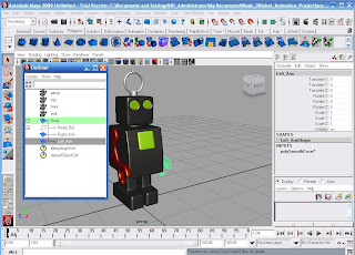
Selecting and Animating certain assets of the Robots body, such as arms, head, anntena.


Using the Graph editor to ensure the specific assets of the Character move correctly with the Animation. Setting the course for the Robot to walk on.


Ensuring rendering settings are correct!


Batch rendering, which took absolutely ages. Afterwards, the additional long task of saving as a TIFF format.

Image and video hosting by TinyPic


Image and video hosting by TinyPic


Monday, 19 October 2009

Concepts and final peice work

Hey folks

I am currently creating my final peice, which shall we say, is rather tedious. I have come across many different ideas over the past 4 weeks, finally bringing them together to hopefully create what I can see in my head.

The Artists I am taking insperation from are:

  • Robert Mapplethorpe - for his ability to really grab the attention of the onlooking audience, through means of shock and disturbance. I came to the conclusion that this method is the strongest of all and provokes a serious reaction.
  • Barbara Kruger - For her stab at the heart type word play, its amazing how upfront she can be even on a metaphoric level.
  • Andy Warhol - For his unpolished, rough, vibrant style.
    You will notice in my images I am not going for perfection, far from it in fact. This art must represent my soul in some manner, and as it is corrupt as everything is on this planet, nothing should be perfect.

Heres a few images from things ive worked on:


This image came from when I was depicting myself in a more Cartoonish type manner. Ive been experimenting with the construction of lines on my face, which build up the anatomy to become recognisably me. I decided upon a photograph, which I had sketched (look in my previous post about self sketches) and kept working from it as I felt the angle of my face with the given expression gave a lot of heart about my character. Although somewhat cliche, observe how im surrounded by darkness, with the light being pinpointed on my face. This represents how ive felt vunerable in the past, how ive been put on the spot many times and how ive faced many other difficulties in life, such as epilepsy. The red stands for blood, where the shading would be. This shows how even though I am my own blood, I dont understand it. The use of the blue in my hair is saying, who really are we? Why are our visual identities as they are? Can you tell who I am from something else? This is just a mask of questioning such ethics.

This image represents how I am hidden inside myself, to find me you must get close to me first to see within. I wasnt actually finished with this image but for some reason I felt inclined not to work any further. The rough, messy finish also helping to portray this identity clash: the person people think I am, or expect I am, is what they expect from themselfs. I am constantly shrouded by ongoing perceptions of myself, just like every other human being. Therefore, do we truely know our identities? Its a very messy subject indeed. I for certain am not clear about who I am at all.

This image is truely taking a leaf out of Robert Mapplethorpes book, I aimed to shock my audience. In fact, theres clear insperation from Barbara Kruger as well via the text. Although on first glance, someone may think "Chris is suicidal!", thats not what the message is at all. Im trying to depict the image that to know yourself you must look inside, not be ashamed of who you are. Notice how the barrel of the gun aiming at my head symbolises how precious life is, how were only flesh and blood at the end of the day and we dont live forever. This is also shown through the blood around my eyes. I appear to be looking away from the Gun, almost ashamed, somewhat intimidated. Time is of the essance if we want to learn about ourselfs, so just as the image depicts you've got to dare yourself to look inside... Again this image isnt to be perfected, its still got rough edges which show how unless we actually bother to observe ourselfs properly we will never be complete.


This image was purely just playing around with metaphoric concepts to describe identity. I was going to recreate this image, but I felt it was somewhat weak and there wasnt much else I could do for it. The images meaning however is rather strong, purposfully inflicting horror and disturbance towards the onlooking audience. You will notice the text around my face is worded as if the alien is speaking to me. The text depicts the message of "who am I?", making my character appear lost and uncertain about my mortality. In a sense, the word Alien means unknown, therefore the whole image is simply a paradox of itself. The Alien, is actually me, on a quest to find oneself.

In my task to understand the structure of my face for my portrait, ive produced many sketches and a few paintings of myself. Ive used different styles to depict my image, from Charactures to two tone posteration. I felt I needed to do this because my final peice relies strongly on the lines that structure my face, so becoming familiar with them is important. Notice to capture the lines efficiently ive used a thick brush for the above painting.


AND HERE IT IS! Im working on my tedious, time consuming final peice.

It is built up of words used to describe me, which is also contrasted with my reactions to the opinions. I even put in random text from "of the moment" thinking, thus making this image feel far more alive and a part of me than any of the other concepts. It will have some colour to it when completed, with other text based layers following different themes to my questioning of identity.

Lighting scenes


This is the one point lighting (front) image showing the light from a single object hiting the subject, with colourisation from the light source.


This second image shows light behind the Character, creating a glow effect.


This third image shows the Character laying down in the sunlight, on the surface of Mars. Notice that due to the atmospheric conditions the lighting is tinged in Red.


This image shows the use of three point lighting. Notice the different tones of light hitting the subject.


This shot shows the Alien Character in an early morning lighting style.


Heres the lighting set to depict the atmosphere of a mid day setting. Its bright and somewhat happy in appearance.


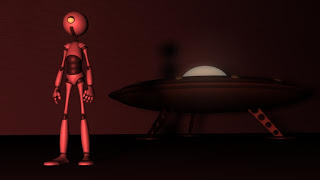
In contrast to the previous lighting, heres the Character and his ship set in the dull, low light, blue tones of the night.


This image captures the Character in a tone that inflicts a "horror" style atmosphere.
Yup, its the blood red that does it...


Heres another render showing the lighting to depict a Sci Fi style enviroment. Very spooky!


Finally here is the Character in a "Fire"-esque style lighting. To give it extra warm I created more yellows fused with the red in the texture node.

Sunday, 18 October 2009

The facebook test plus chosen essay question

One thing this unit has taught me is about how self perception can be such an influence on our identities. Even the smallest changes to our apperance, mannerisms or even personal interests can effect the way we are perceived by others, thus giving us "labels" and making people see us in a certain way. Our identities are constantly corrupted by this attitude towards one another, each day we meet different people, go to certain places and this as a result can effect the aura of who we are.

Id like to take this moment to breifly explain about a test I done to prove this theory. I decided while making portraits to change myself to depict different steriotypical images to gain a reaction from my peers. Just as planned it worked.
This image of myself depicts a dark, sinister somewhat evil energy. You will notice the tones of blue merged into the image, to help make the image "feel cold". The comments I got for this were of shock, people would say I "looked like a serial killer". How does this image make you feel?

I also posted this one up, which shows me following the visual steriotype of the emo trend. The long fringe covering one eye, the black and white colouring, my eye still blue to make the image more intense between the picture and the onlooker. To make this image come across more as my personal "identity" I even added my nickname to the picture. The reaction I got to this was most amusing, people would call me all sorts of derogatory terms, best freinds suddenly turning on me for conforming to another image thinking I was no longer the Chris they know and love.

Does this mean that to really observe someones true personal identity its better to be blind and socially unaware? I think so.

ESSAY QUESTION!!!

Well I was going to do my essay based on "What creates a strong emotional response in portraiture art and why does society affiliate such power so critically?"

I was told that this was not direct enough to the subject of portraiture Art, yet not wanting to conform to the typical identity question id like to somehow stick to this route.

Take it easy folks

Chris

Saturday, 17 October 2009

More self analysis - do my hobbies help depict my identity?


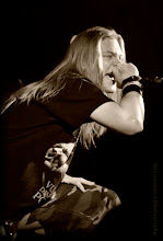
Heres a bit of a random one, but I thought id post it up out of interest in relation to a previous blog about Artists portraying their identities through work and to help further show an inside to who I am. The video in this post will show my band playing a gig. A lot of people are quick to mention I dont appear the type to do the singing role in a heavy rock band, its as if certain things are expected from such a person. Therefore, does my role in my band help to further capture my energy? From a direct approach in observing my appearance, you could say im just using a mask to hide myself to perform my alter ego for the crowd watching. On another hand you could argue that this form of music helps to push out a side of me which holds many closed doors, secrets, frustrations and aspirations. As a result this could also further show how as individuals we are corrupted by others views on how life should be, therefore even in the face of truth having to put forward a safety mask to cover our identities.

Friday, 16 October 2009

Concealment of identity - is it possible?

I have been observing the faces of different people in the media spotlight and came to the conclusion of an interesting range of ways they depict their identities.
While most Celebrities like to be open, perhaps too open, about their personal lives, many will seek solitude in some way or another.

You could argue that some well known faces are just masks for who they really are; you never really understand the character underneath. Whether this is done on purpose or not depends on the person, but I feel it is important that someone under the spotlight should be able to have some form of privacy. Interestingly enough most people will depict a persons identity through the characters portrayed through an actors work, or how a musician provokes his audience through their work.

I have found however a minority of artists who choose to keep themselves discreet for the camera, not allowing people to catch a glimpse of the person on the inside. The mask is shrouded over them to protect their identity and push out their message further.

The one act that really stands out to me is a band named Slipknot. All of the members of this band are reformed into somewhat scary, illusive characters by the addition of wearing masks.


http://folk.uio.no/perbenn/Slipknot%20Masks.JPG

This arouses a strong statement of how they just want their music to be heard, they want to shock, to provide some form of power through fear, how they will not be commercialised via their personal identity. In many respects they are trying to say they are your every day average person who passes you on the street, you arent suppost to know of their true identities. The question is though, this alter ego they elaborate on - does it show something deeper about themselves as individuals?

I think its somewhat retorical to ask, there is no direct answer, its down to opinion, which makes these characters very interesting indeed.

Photoshop class - merging images

In our last Photoshop class we learnt how to merge images together to make one composite.
Somewhat a simple task but here was my result: